Bad Data Blues

Swamped ?
We live in a sea of data; it’s all around us and everything we do seems to generate more of it.
But what exactly makes data useful and how can we make better judgments based on it?
When does data become information (that’s useful) and how do we recognize the difference data and information ?
Data analysis tools have improved greatly over the last 20 years with it now being possible to produce beautiful graphics at the click of a button. But when you’re presented with these graphics, are you looking at how pretty they are, or are you thinking about what it all actually means?
Here are a couple of things to think about with some of the data sets that have come across my desk in the last year.
One: Asking Questions; What am I looking at here?
The interactive map below came to me via a WhatsApp group from one of the groups’ greener members.
It’s actually a very good representation of what will happen as the sea level rises with global warming. You can put in a sea level rise and see how it will impact the area you are interested in. The areas below sea level will be highlighted in red.
You can try it out here: Climate Central
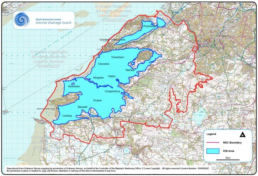
As you can see with the example below, a lot of West Somerset will be quite damp… but what the map doesn’t highlight is that most of that area is already very damp.
The Somerset Levels are an area that has been reclaimed from the sea over the last 500 years; most of the land is either at, close to, or below sea level.
The water level is maintained by a complex set of drains, ditches and pumps. You can find out more here: Somerset Drainage Boards
You get the same sort of picture if you look at the Fens in East Anglia or Holland. Yes, the land is technically below sea level and raising the level by another metre wouldn’t be great, but thats not really news to anyone who lives in the area.
The other aspect of this model that I would take issue with is the amount of sea level rise it allows.
It was sent as a link to the group with a 3 metre rise which, not surprisingly, looks catastrophic, particularly if you live in Central London; there would be a whole new waterfront in Wandsworth. However if you look at the climate research over the next 100 years no one is projecting a sea level rise of over a metre.
Remember to ask the ‘are you sure?’ question and fact check.
So lesson #1:
Understand what the graphic means in the context of the on the ground reality.
Two: Understanding where you are going is more interesting than just knowing where you are.
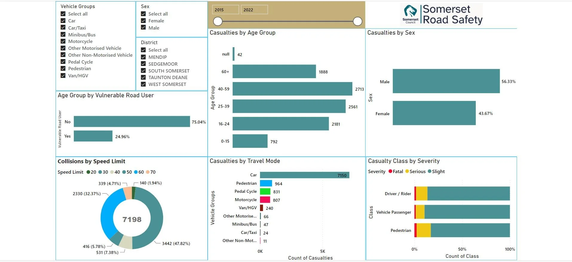
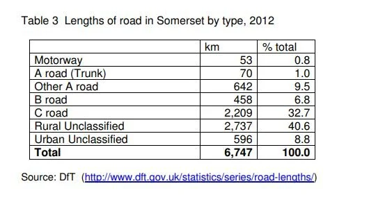
This one is another Somerset-orientated data set; this time from the Roads, Highways and Safety department at Somerset Council.
They are making really interesting use of Microsoft Power BI to plot out accident statistics from the data they collect.
Their dashboard is here: Somerset Road Safety Dashboard.
So what’s wrong with this you ask ?
Well think about it. What question is this information answering easily?
Hypothetically, if you are a Somerset resident you would want to know if your roads are getting safer. It’s a reasonable question; you are, after all, paying for the Somerset Road Safety team.
If I fiddle around and slide the slider I can make the dashboard display data for the different years, but what I can’t do is display the trend in this data. For that I need a good old pen and paper. Which, given the cost of a Power BI license, is a bit disappointing.
Another thing. How do I gauge whether having 7198 accidents in a year is a good thing or a bad thing? Is my accident rate better than the national average, or am I taking my life in my hands getting in my car or even just walking down the street?
Would I be safer if I lived in Dorset ?
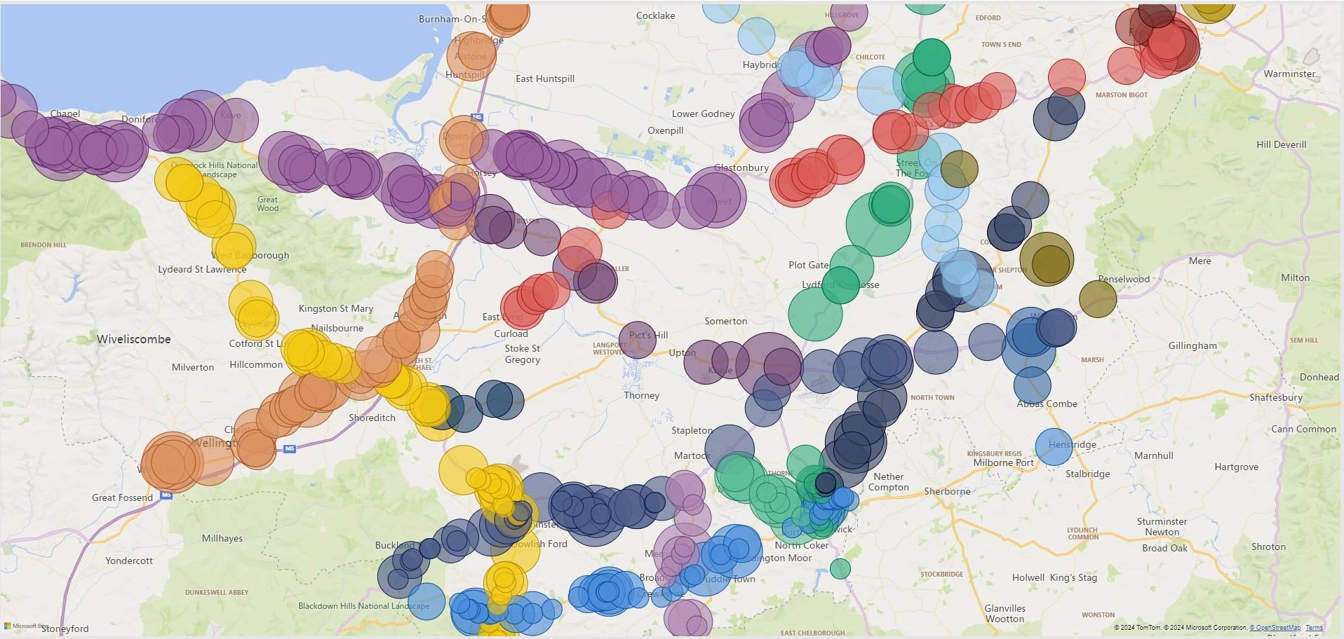
I do like the idea of the map on the right … but should I really be surprised that the accidents are on the roads with most traffic, or on the roads at all?
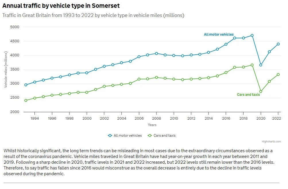
If we do a bit of digging on the internet we can find the stats for the number of miles driven each year in Somerset which looks reassuringly plausible.
Department of Transport Road Traffic Stats
But how does the UK Government know how many miles I drove?
More digging would be required to validate the methodology used to collect that data.
But it’s not as simple as the number of miles driven.
Some miles are more dangerous than others.
Somerset has a disproportionate number of rural A, B, C and unclassified roads, and as the road safety organisation Brake says;
“Per mile travelled, rural roads are the most dangerous roads for all kinds of road user.”
Have a look at this link if you want to be persuaded of the wisdom of driving slowly;
Much of the logic behind low traffic neighborhoods and 20 mile zones relates to the idea that if you are travelling on foot or in a car in those areas and have an accident, speed is a significant factor in the accident outcome.
According to the British Medical Journal it’s not even as simple as the miles driven and the roads you are driving on.
It’s about our behavior behind the wheel and what we get up to.
“Road traffic accidents (RTAs) are a major cause of mortality, injury and financial cost,1 and it is generally acknowledged that human error is frequently involved.2 There has been considerable research on risk factors for RTAs, and legislation aims to prevent some effects (eg, effects of alcohol and drugs). Other issues such as fatigue are often addressed in professional drivers3 and the general public.4 Driver fatigue is now considered to be a major contributor to 15–30% of all crashes.4–8 Inappropriate driving behaviour (DB) (eg, speeding) is often dealt with by sanctions and/or by attendance at appropriate training courses.9 A major problem with much of the research is that factors are often studied in isolation whereas it is clear that a multivariate approach is essential. This is true for the risk factors and the outcomes. In addition, it is important to adjust for possible confounders, which may influence risk factors and outcomes (eg, demographic variables, lifestyle, job characteristics and psychosocial factors). In order to conduct such research, it is important to develop short measuring instruments that collect data on a wide range of variables. This approach has been used to address issues such as well-being10 and can now be applied to driver safety.”
So where does that leave us in relation to the beautiful Power BI Dashboard at the top of this example?
Well to be honest I can’t see that any of the numbers on the dashboard are actually likely to link directly or even somewhat tenuously to the safety of travel on our roads.
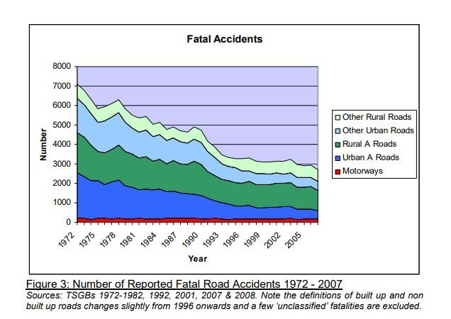
The data from the RAC foundation would suggest that road safety has improved significantly over the last 40 years which, given the number of miles driven has gone up each year, is a very positive trend.
A lot more use can be made of the spatial distribution of information (plotting accidents on maps). Done well, it can be very revealing, particularly if you are looking for problems to solve; the accident ‘black spots’ and areas for improvement will be much more visible.
But are the statistics on the dashboard useful?
So;
Lesson #2 :
Less is usually more. A few well considered facts are much more useful than hundreds of randomly collected data points. Trends are interesting as is comparative information.
A great example of data not necessarily equaling information.
Three : Calibration; Knowing how your data is measured is really important to how you act in reaction to it.
Not wanting to pick a fight with NOAA here…
This from this site; NOAA Projected Sea Level Rises to 2100
A couple of things to contemplate.
The average sea level rise isn’t really that interesting as a statistic. We don’t get flooded on average floods; speaking from experience it’s the outliers that swamp us.
Also it’s important to understand what you are actually measuring. There is more than one way of measuring sea level, for example the depth of water from the sea bed versus measuring the sea level height with a satellite. Whilst it’s obviously useful to measure the surface of the water with a satellite, it doesn’t necessarily tell you how deep the water is.
Looking at the first image above.
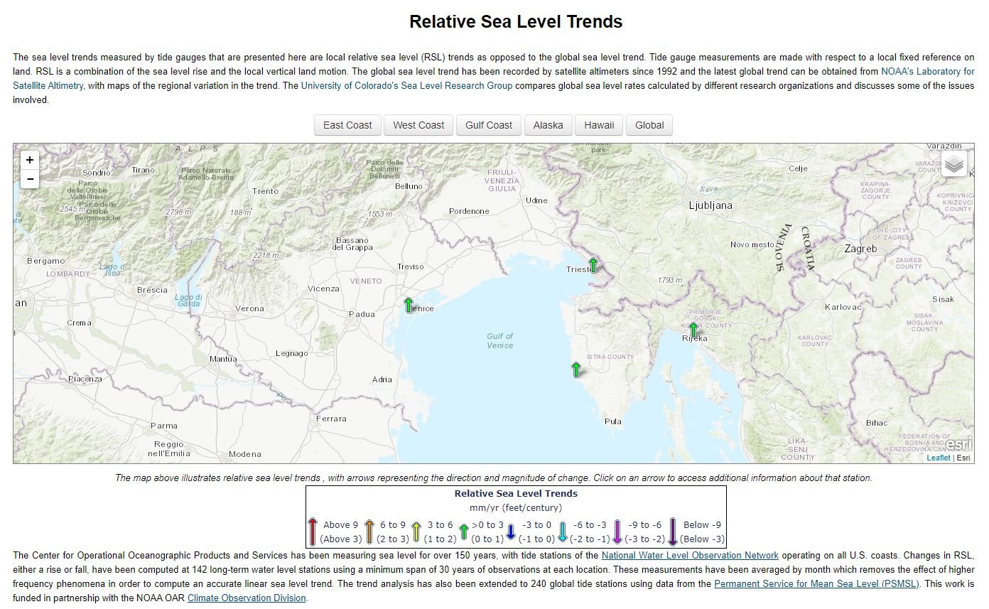
The Venice Relative Sea level gauge is a good example of how something simple can be deceptive if you don’t understand what is being measured.
There is a big fresh water aquifer under the Venice lagoon. The effect of water extraction from the aquifer is causing the bed of the lagoon to fall; that is something we all learn in GCSE Geography. Venice itself is sinking due to extraction of ground water from the aquifer under the lagoon; something like 9 inches since the 1970's depending on where you go to get your stats from.
Nature talks about the effect of human activity on sea floor in coastal area in this article
The NOAA data is relative to a fixed point on land.
When the lagoon bed falls, it’s effectively standing in deeper water. Think about it as having a ruler in puddle; take a spadeful of soil out of the bottom of the puddle and it gets deeper, with the number on the ruler going up, but the surface staying the same height.
So is the sea level rising or the gauge falling?
Coming back to the puddle example.
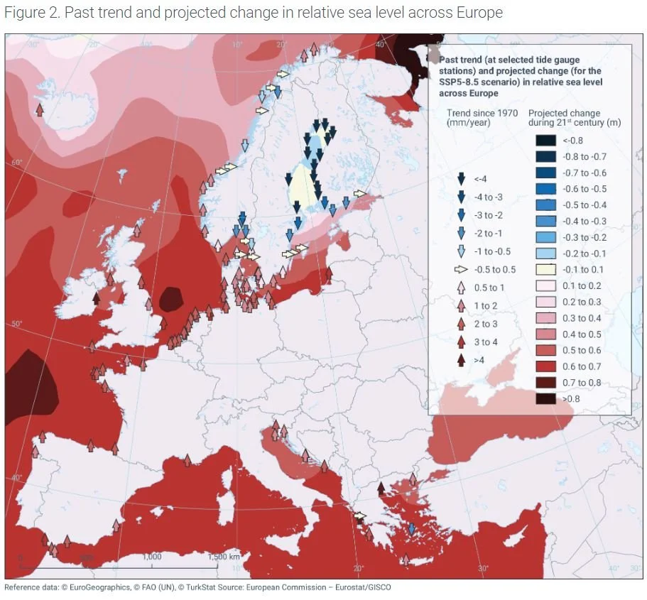
The next image is of the sea level gauges in Europe from the EU. It’s another great example of the quality of graphics that are now available and this one does actually explain some of the quirks to the data.
There is another interesting Geological effect that you need to take into account when measuring sea level depth; Isostatic readjustment.
Basically if you put a heavy weight (a large ice sheet) on an area of the earth’s surface, it sinks. When you take the weight away (when that ice melts) the area comes back up again. It’s a bit like when you turn over on the mattress in bed.
Sweden, Finland, Norway and the Baltic states were all once covered in a glacial ice sheet which lowered the land mass.
It’s now coming back up, so parts of the Baltic are actually getting shallower.
The sea level stays the same, and the water gets shallower.
You can find out more about this data set and the graphics here;
European Environment Agency; Global and European Sea Level Change.
Continuing on the sea level calibration theme.
How do you know if your instruments are accurate?
Is the information you are receiving accurate?
You need to think about how you validate the information you are getting.
You would think that if you knew where you were, you could just look on the map and the tide table to work out how deep the sea is. But sadly it’s not that simple.
The sea level can also vary depending on atmospheric air pressure.
According to the Swedish Meteorological and Hydrological Institute:
“High air pressure exerts a force on the surroundings and results in water movement. So high air pressure over a sea area corresponds to low sea level and conversely low air pressure (a depression) results in higher sea levels. This is called the inverse barometer effect.
The average sea level during a year is 0 cmPGA and the average air pressure is 1013 hPa. Since the air pressure normally varies between 950 and 1050 hPa during a year, the expected variation in sea level due to air pressure is between +63 cm and -37 cm around mean sea level.”
SMHI : Air Pressure and sea level height
The prevailing wind also has an impact in some sea areas. So a prolonged Northerly wind in the North sea effectively shoves the water in the North Sea to the Netherlands and East Anglian shore.
So you need a simple method to calibrate your data source.
With the depth gauge it’s easy; you put a weight on a piece of string and put it over the side of the boat to measure the depth, then compare it to the number the dial gives you.
Obviously if you are using a satellite to measure sea level height it’s a lot more complicated.
We could also talk about rounding errors and the importance of being consistent in the way that you measure things here as well. Particularly around feet and inches, metric and imperial, inc and ex VAT.
For students of how not to do it, Google NASA’s Mars Climate Explorer project.
Los Angeles Times archive : Mars Probe Lost Due To Simple Maths Error
Lesson #3.
If you don’t understand your data collection method and its accuracy you risk misunderstanding what the data from those sources is telling you.
As an additional thought on this one. This is particularly important where you are combining data from different sources. Are the instruments calibrated to the same standard. Are you using the same currency or units to report your measurements ?
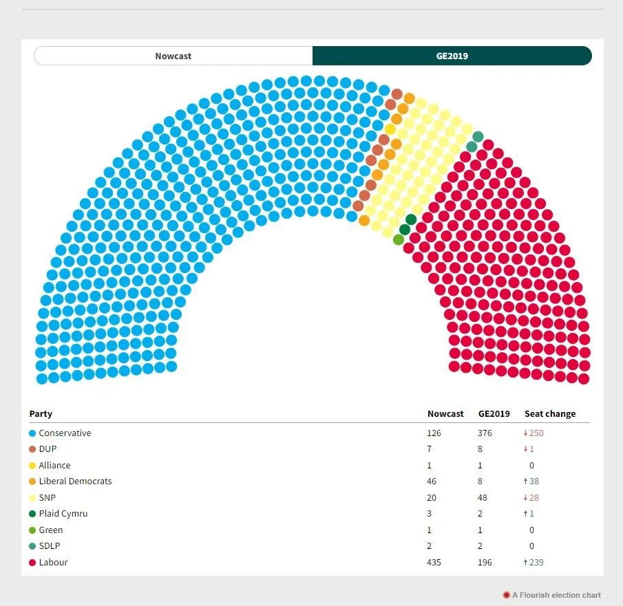
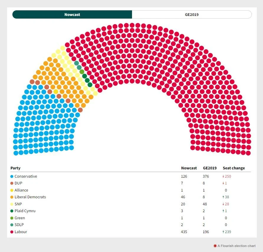
Four: Elections; Understanding your margin of error. Just how bad is your data ?
There will be a lot of election statistics produced over the next 9 months in the UK as we run up to the next UK General Election.
I’m picking on the Nowcast example for no particular reason other than that the graphics are quite good. You can find it at the link below;
Elections Map UK : Nowcast Interactive Map
Margin of error is about understanding how confident you can be in the predictions your model is allowing you to make. Or to put it another way; how likely it is the suggested result is complete nonsense.
It is a statistical technique and probably beyond what most of us would consider, but as an idea it’s a relatively simple and a useful construct.
Survey Monkey has quite a good definition:
“Margin of error tells you how much you can expect your survey results to reflect the views from the overall population. Remember that surveying is a balancing act where you use a smaller group (your survey respondents) to represent a much larger one (the target market or total population.)”
Survey Monkeys margin of error calculator is here;
Calculate a margin of error for a survey
The logic being that if you ask everyone in your target population, you should have a relatively low margin of error. If you only ask a few people, then you should expect a higher margin of error.
The other thing worth keeping at the back of your mind is that people don’t always do what they say they will. Their personal motivation and math change even over a short period of time.
To quote Nowcast :
“THE MODEL
The ‘Nowcast’ model is based on recent GB wide polling, as well as Scottish & Welsh only polling. Data is from all published polls from British Polling Council members over a given month, with polls weighted by recency as well as historic pollster accuracy. These GB-wide numbers, as well as recent national and regional polls, are then run through the model and some corrections may be applied for seats with unique circumstances e.g. by-election results or a scandal surrounding the incumbent.
It is important to remember that the Nowcast indicates how a General Election would look if an election were to be held today, not in a few months or years time. It is not a prediction for the next election, rather a snapshot of public opinion at the time of publishing.”
Note the effective disclaimer in the second paragraph; this is what they told us when we asked, but it doesn’t mean that’s what they actually think.
That margin of error can easily be the difference between success and failure.
Suppose your margin of error is 5%. If the vote is within 4% it’s too close to call; remember the Brexit vote?
The Nowcast model in these images suggests that the Conservatives could lose 250 seats at the next generate election or 66% of their seats. Is that realistic ?
We’ll come back to this later.
Lesson #4 then is:
You need to understand how accurate your information is (I think this is a repeat).
If you understand how bad it really is then you can adjust your decision making process accordingly …. in a nutshell don’t kid yourself how good your data is.
Five : Validation of your data; how do you work out if your model is any good ?
The model versus the real world.
So you spent months building a model and you have a lovely set of predictions but are they actually any good?
We have already talked about the importance of calibration in instrumentation and data collection but you also need to calibrate your model. Think of the model as the engine into which you pour all that collected data. You crank the model up and ask it questions. But is your engine wired up in a way that means its predictions are any good.
You need to run your model against the real world and see how its predictions match up.
There are stages in the process;
Create a model for your hypothesis
Test on a limited scale
Release into the real world and see how good your model really is.
Think about the process of developing a new F1 car. The teams develop the model using a computing technique called Computational Fluid Dynamics (CFD); basically a complex model of how the air will move around the car and the forces that will be exerted to create lift or down force.
They then create scale or full size models to place in a wind tunnel. That allows the team to create an initial validation of the CFD model. Step 2 above.
Assuming that works out they can have a level confidence about how the car will perform when it reaches the track.

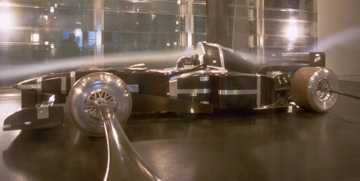
Its a lot easier and cheaper to change the car at the design stage.
Wind tunnel time and testing in the real world is expensive so its vital that model is a good representation of the real world.
But that ability to validate the CFD modelling gives teams with deep pockets a huge advantage so much so that the F1 governing body have restricted the amount of wind tunnel time the leading teams can have the aim being to give the teams with slower cars the opportunity to validate their models more effectively and catch up.
Formula One Wind Tunnel Testing Rules
But the thing to remember is that if the calibration of your model is off and things behave in the real world differently then you are going to waste a lot of time and energy going no where fast. Similarly if the second stage is not representative of the real world then the results from the model and initial testing sequence will not be repeated in the real world.
This is what happened to the Ferrari F1 Team in 2011.
Ferrari Formula Team 2011 Wind Tunnel Issues
Lesson #5
You need to test your tests.
Six: There are certain constraints in the real world that just can’t be worked around even if the model says they can …
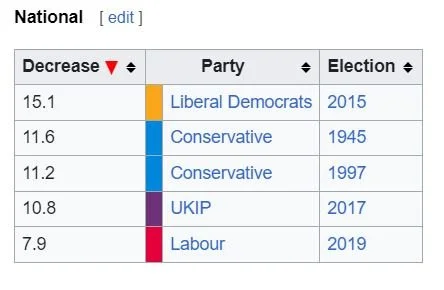
I may be sticking my neck out here. The current UK government may be about to set a new record; but looking at historical UK election statistics the worst ever election performance by a UK political party was by the Liberal Democrats in 2015; they saw their vote share fall by 15%.
Pulling the numbers from the Nowcast example used previously.
If the Conservatives have a 15% collapse in their vote share they could be looking at losing 57 seats ((377/100) *15 rounding up).
The Nowcast polling data has the Conservatives losing 250 seats something that on the on the basis of previous performance would be unprecedentedly bad.
The election swing history is here;
Why is that unlikely ?
In the real world there is a middle ground of seats that change hands at an election.
How big that middle ground is varies but the important thing to remember is that in a lot of seats the average voters math shifts between the election survey and going into the polling station. The other complexity is the UK first past the post voting system. Our first pat the post system means the party with the most votes wins the seat. A party could get 40% of the votes in all its seat winning constituencies and win a bigger majority of the seats in parliament. 40% of the vote share doesn’t translate to having 40% of the seats in parliament.
Lesson #6
You need to make sure your model takes into account the on the ground realities; or at least formally acknowledges and compensates for its own inadequacies.
But bear in mind that the whole point of a statistical outlier is that it can happen. Its just not very likely.
Conclusion
So what can we take away from all this:
Know the question you are looking to answer.
Make sure your model reflects the real world.
Make sure you have calibrated the data you are getting.
Make sure the data you are getting is accurate.
If the data isn’t accurate, make sure you understand why it isn’t accurate and by how much.
A lot of time you are testing a hypothesis; x causes y; make sure you have the hypothesis correctly outlined and be open minded about the answer you are getting.
It’s really easy to generate pretty graphics but pretty and meaningful graphics are much harder to produce.
Maps are a really good way of portraying certain types of information.
At Be Astute, we spend a lot of our time talking about the process for producing meaningful information.
In you want to know more about the work that we do get in touch.